This article will discuss the Home Screen Quarterly Stats Tab.
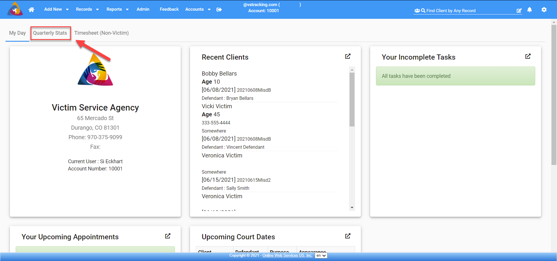
From the Home Screen click on Quarterly Stats located just below the top blue bar, on the left side of the screen, next to the My Day tab.
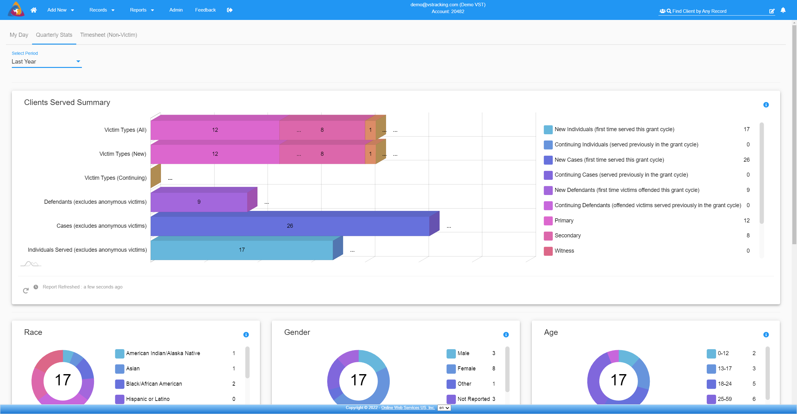 Here you will be able to choose the date range in the upper left corner from the dropdown. The default is Quarter to Date, however, you can choose Last quarter, Year to Date, Last Year, Month to Date, Last Month, or Custom. The Custom date range will allow you to choose a beginning and ending date.
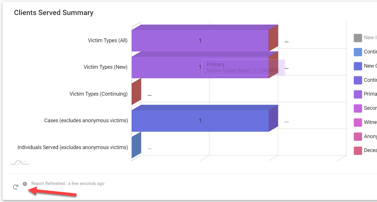
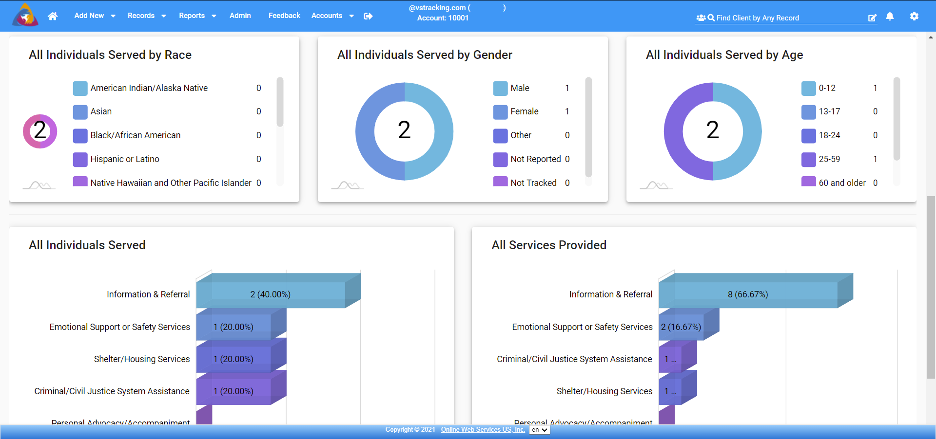
You will see the Clients Serviced Summary Report, All Individuals Served by Race, All Individuals Served by Gender, All Individuals Served by Age, All Individuals Served by Service Category, and All Services Provided. Each of the top 4 graphs are interactive, meaning you can hover over the graphs to view the data, and if you click on the items in the list sections on the right of the graph it will exclude it from the counts and graphs.
 These stats currently display agency level statistics.
ROADMAP: In the future, admins will be able to choose an advocate name from a dropdown list and see just that advocates statistics. Admins will also be able to see the entire agencies statistics. Individual users will only see their own statistics.
Hovering over any of the graphs will show the information for that part of the graph in a dialog box. It will include the label of that data, how many of that item, and the percentage of that item.

Clicking on any piece of data in the lists of the top 4 graphs (on the right) will allow you to turn off, or not include, that specific piece of data in the rest of the graph. You will also notice that the percentages will be adjusted in the rest of the data for that graph.
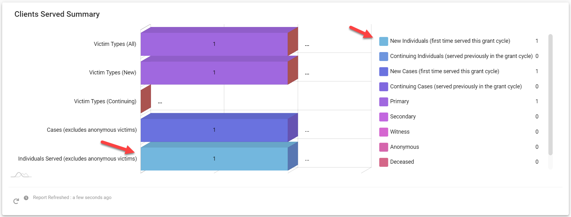

Below each report, you will see a circular arrow icon. This icon will refresh the report to include the most current data entered. Next to the circle arrow icon, you will see the last time the report was refreshed.